|
|
|---|
Tuesday, November 16, 2010
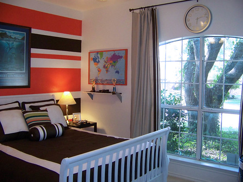
A Pretty Bedroom Makeover

Monday, November 15, 2010
One Way To Keep A Bedskirt In Place
Janell did a bedskirt post the other day and there was discussion in the comments about how everyone kept theirs from moving around (or not). I said that I would do a post about a solution that works for me, so here goes!
Sunday, November 14, 2010
How high do you hang your curtains, and what about that space?
- Higher is better. It adds height to the room and more presence to the windows. I also like them hung off to the side with the inside edge of the panels just covering the inside of the window casings because it makes the windows appear wider and allows more light in.
- Southern living - "Hang your drapes high. To create the illusion of a larger room, hang your drapery rod just below the ceiling rather than right above the window frame. A higher rod draws the eye up and allows more light to come in. If the ready-made curtains you love aren’t long enough, add a simple band of fabric in your accent color for a custom look that costs a lot less."
- From Canadian House and Home's How to Hang Curtains - "For standard drapes that hang on either side of a window creating a frame, the typical height at which to install the drapery rod is halfway between the top of the window and the ceiling. This applies if there are more than 12 inches between the window trim and ceiling. For a cathedral ceiling, try to leave approximately 4 to 6 inches above the window trim as a guideline. If your ceiling is low, consider installing the rod as close to the ceiling or crown moulding as possible. In a small room, hanging drapery panels as high as possible will give the illusion of extra height."
Many times hanging the treatments higher is not that much of a stretch because the window is fairly close to the ceiling.
But other times there is a space between the top of the window and the rod. Almost every time I would suggest curtains be hung higher than the window (without a top treatment) when the ceiling wasn't in close proximity, I would get the question "but what about that space?"
![]() |
| Colour Confidential |
A cornice board is an option everyone is probably familiar with...
![]() |
| Colour Confidential |

GCI Design used artwork...

Monday, November 8, 2010
A quick tip about color and contrast
The bedroom above was just one of the rooms in art teacher and painter Ellen Small's home that was featured in this month's issue of Traditional Home.
It's a pretty room with it's light blue walls and breezy bed curtains, but my eyes were immediately drawn to the artwork above the bed. Why? Because our eye is drawn to color and it's the most intense color in the room, in high contrast to the walls. This intense pop of color further establishes the bed/artwork as the focal point of the room. If similar artwork were on other walls in the room (which it may very well be, we just can't tell from this view point), this artwork would lose some of it's impact. That would be fine, too, it's all in what you're trying to accomplish.
THE TIP(s):
- If there is something in the room that you want to highlight or make a *focal point, using contrast and color is one way to make sure it gets noticed.
- In the reverse, if you're not particularly fond of something and don't want people to notice it the minute they walk in the room, neutralize it. Make it blend in with it's surroundings. (For instance, if you had an old and worn chair that you're just not in a position to replace or slipcover yet but it's attracting attention because it's the brightest, most colorful piece in the room, covering it with a throw that was closer to the wall color would help it blend in and instantly become less noticeable. -- Adding more items around the room in that same bold color would be another way to take the focus off of the chair.)
- Lack of contrast is also a trick that can be used in small rooms. If the major furniture pieces are very close to the wall color, the room feels larger because there's no real contrast between the two.
*Want to know more about focal points? I'll be talking about them in an upcoming post.
Photo by Joe Schmelzer
Thursday, September 30, 2010
Design Statement - Single Paint Stripe
Remember this image (Kim Coleman Design) from this Creative Decorating Ideas post? There are many things to like about this room, but one of the things that stood out to me was the way they painted the turquoise paint stripe under the ceiling molding and above the floor molding. Small detail with major impact.
I still love the idea and since then have run across just a few more examples of how a single paint stripe can be used to make an impact. The great thing about it is that it would take very little time or money to do, but it can make a room!
Two simple choices here, to use a bold color for the stair runner rather than a neutral and to repeat that color in a simple stripe of paint above the molding, make this a stand-out staircase.
houseandhome.com Photo Dan Duchars
The single stripe in this boys bedroom unifies it and takes it to the next level.
Sunset Photo E. Spencer Toy
Combining a single stripe with the picture frames is a great idea, isn't it?
Wendy at The Shabby Nest used a single paint stripe to create the illusion of width in her sons' narrow bedroom. Isn't it a cute room? You can see the rest of it here.
I don't have an image for this, but in a room with very high ceilings, a single paint stripe painted lower (at average ceiling height) can be used to stop your eye and keep it at room level.
Have you used a single paint stripe to make a design statement in your home? If not, where/how would you use one (or not?)...
Have a great weekend!
Tuesday, September 28, 2010
Clever Curtaining and Other Great Design Ideas
THIS POST IS FROM ROOM REMIX - THE BLOG .
When I saw this home designed by Lindsey Bond featured in House Beautiful, I was immediately impressed not only by the great design but with her clever use of curtains to soften, disguise, separate spaces and create focal points.
You may remember this post where I talked about accessorizing your walls with curtains? I wish I had seen the image above at the time because it would have been another great example for that post. Love it!
In her office, the wall-to-wall open shelves disguise an off-center window while the curtains soften the space and can be closed to hide the shelves when needed (notice the ceiling mount rods). What a great way to keep the light from the window and still utilize the entire space for storage/display. The artwork hung in front of the shelves works to keep your eye in the space and off of the off-center window beyond.
Here she uses curtains to cocoon the bed in its own little room-within-a-room. She calls it her modern canopy.
You can see the other side of the bed curtains below. The beautiful antique mirror is covering an awkwardly placed window.
Here the curtains divide the room and make each space more intimate.
Some other things to note in the image above:
- You may have noticed the statement wall? :-) Awesome isn't it? It's actually a painted screen placed on the wall. I love the simple, bold punch of color in the otherwise neutral space.
- Rather than a built-in banquette, this one is just a long bench with a lumbar pillow that rests against the wall.
- And of course you know I'm a fan of layered rugs. They add incredible texture to this small space.
To see more images of this home and to read the interview with designer Lindsey Bond, visit housebeautiful.com
photo credit: Jonny Valiant
Hope you're having an awesome week so far!
Sunday, September 19, 2010
Inspiration in Green
I saw the bedroom below (designed by Christina Murphy) in the September 2010 issue of House Beautiful and was, of course, completely taken with the fabulous overscaled heaboard. I had marked it knowing I would want to post it for headboard inspiration at some point, and I decided that today was the day!
Here are a few of the other rooms in this light, fresh, creative home...
I love this mirror and the sconces add some amazing dimension to the wall, don't they?
Besides just being great-looking chairs, the chocolate brown lacquered fretwork chairs add contrast and help ground the white dining area.
You know that I'm a fan of painted floors and this one is pretty impressive! The stylized lily pads were painted by Christopher Rollinson.
To see the rest of the home and read the interview with designer Christina Murphy, click here. (photo credit: Ngoc Minh Ngo)
Sunday, September 12, 2010
Neutral With A Pop of color
Traditional Home Photo:Jonny Valiant
Happy Sunday!
House Beautiful Photo Thomas Loof
The great thing about neutral spaces is that it's so simple to change them up by adding pops of color with something as simple as a throw, piece of artwork, pillows, rug and/or accessories as your color preferences change over time.
houseandhome.com Photo Michael Graydon
One way to add a fabulous punch of color would be to make these faux-suzani pillows (using felt) that were featured on Design Sponge (made by Samantha Baldwin from the new york examiner). Complete tutorial here.
Thursday, August 12, 2010
Creative Decorating Ideas
I'll be taking a blog break until after Labor Day, but I have plenty of new posts in the cue for when I return (currently 1/2 finished, of course! :-) ) so I hope you'll stick around. For now I'm going to leave you with a compilation of inspiration and ideas to spark your decorating creativity...
BEDROOM IDEAS
Use a desk beside the bed instead of a night stand. The addition of a mirror and a decorative garden stool allows this to function as a dressing table as well. When not in use, the garden stool can be tucked under the desk, much like a nesting table and, if you're wanting to create some additional interest, why not layer several mirrors of different sizes on the desk top rather than hanging just one on the wall?
Designer Samantha Pynn Photo Virginia Macdonald
The upholstered wall in this bedroom designed by Caldwell Flake is fabulous, and I love the way they've juxtaposed the distressed corbels with the modern shade in the wall sconces.
MIRRORS
I know I've encouraged you to mix things up a bit (for example your dining chairs), but never your bathroom mirrors. What do you think? Of course the idea appeals to me just because it's different, but I'm wondering if I could actually do it. :-) Canadian House and Home
This wall is stunning isn't it? The bold wall color, mirrors outlined in molding, furniture and art layered in front... Inspiring.
Tobi Fairley/At Home In Arkansas
ART
More words on walls, because you know I love them. Can't get much more simple than this technique...
Veranda Photo Antoine Bootz
I love this vignette designed by Tobi Fairley and featured in At Home In Arkansas. I've seen a lot of people painting designs like these on their walls lately and I'm loving it, but those same stencils would be great for creating wall art on canvas. What a simple, sophisticated graphic statement! 
I think using this mirror in the center of the plate display gives it a fresher, more modern feel. They've also used coordinating fabric and ribbon around the flowers on the table to tie them into the scheme...
Rather than framing your art, you could clip it to clipboards and display it. This idea would look completely different depending on the type of clip boards and art used (for example, very colorful clipboards with kids art, or all black clipboards with modern art, or all white with botanicals, etc. Limited only by your imagination.)
Elle Decor Photo Pieter Estersohn
Outline a corkboard with ribbon and frame it in a statement-making frame, then hang your favorite necklaces from it. This keeps your necklaces within easy reach while at the same time functioning as "art".
Canadian House and Home
ADDING ARCHITECTURE
If you're not really a diy'er in the power saw sense, this idea from BHG.com could be for you. They suggest adding some simple architecture to your space using ordinary picture frames!
LIGHTING
We saw in this lighting post how
BHG.com
and
Dwellings by Devore
updated outdated chandeliers with drum shades (excellent idea, right?).But BHG.com also suggests replacing the glass globe on your ceiling fan with a drum style shade for a simple update that will pack a punch. I agree...
Lamps on pedestals versus floor lamps...
Traditional Home Photo Colleen Duffley
Looking for more out of the box ideas? Click here...
Enjoy the rest of your summer. Hope it's FABULOUS!